
Yes, I am an Apple fanboy, let’s get that out of the way right now. I have been using Macs personally, and then professionally for over two decades now (since before the first iMac even existed).
Over that time I have experienced a monumental shift, from obscure computer company that many of my classmates in the UK hadn’t even heard of, to one of the most recognised brands on the planet.
And I have been there the whole time for the ride.
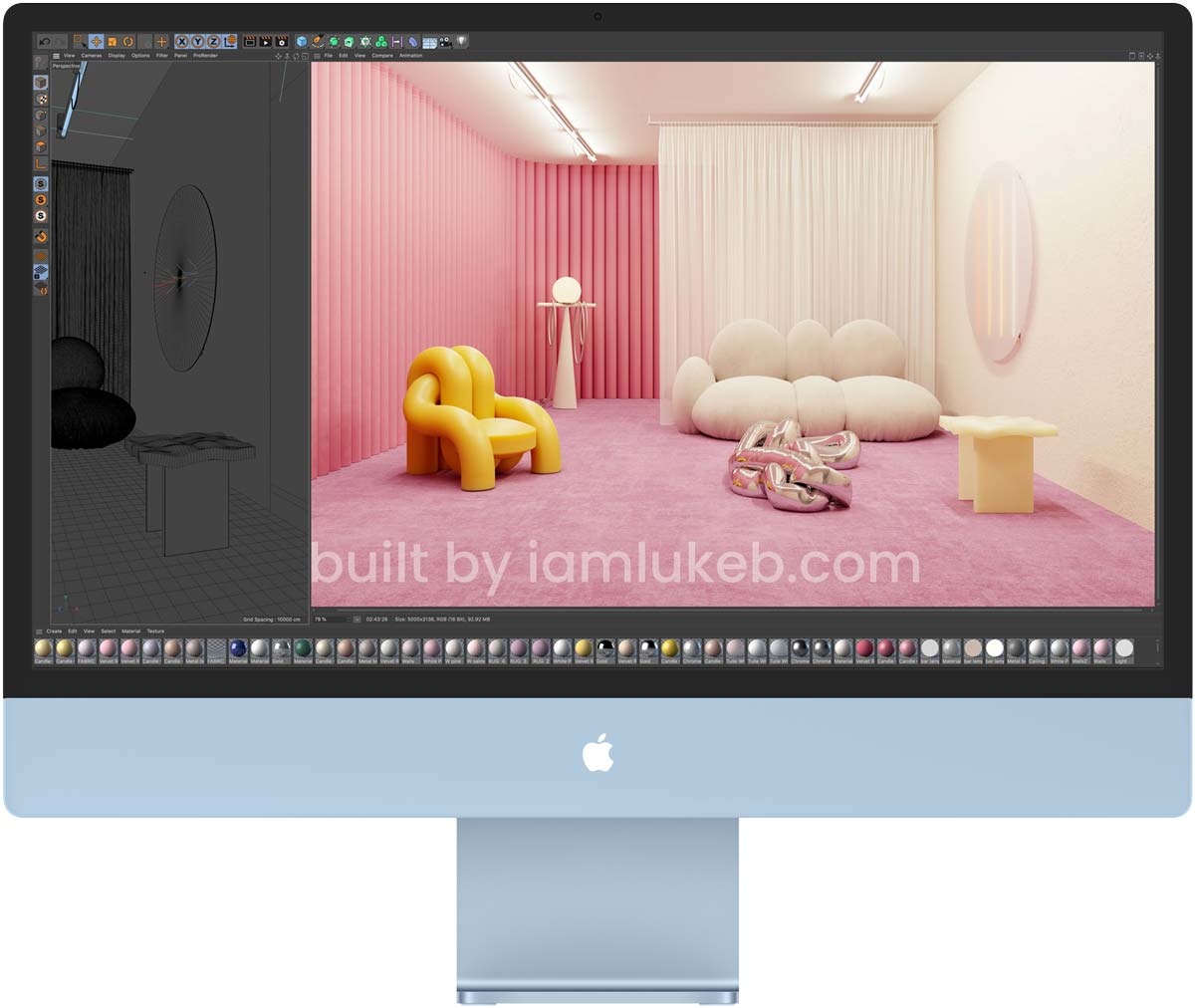
I own a 27″ iMac, but it is getting long in the tooth, as it isn’t the most recent (pre-M1) design, it is the chunkier model from a few years back.
This has put me squarely in the market for a new Mac, and as rumours had been circulating for a while that the spring Apple event would unveil some new iMacs, I waited with excitement for the announcements.
Unfortunate, what we got, wasn’t what I was expecting… Well, it was half what I was expecting.
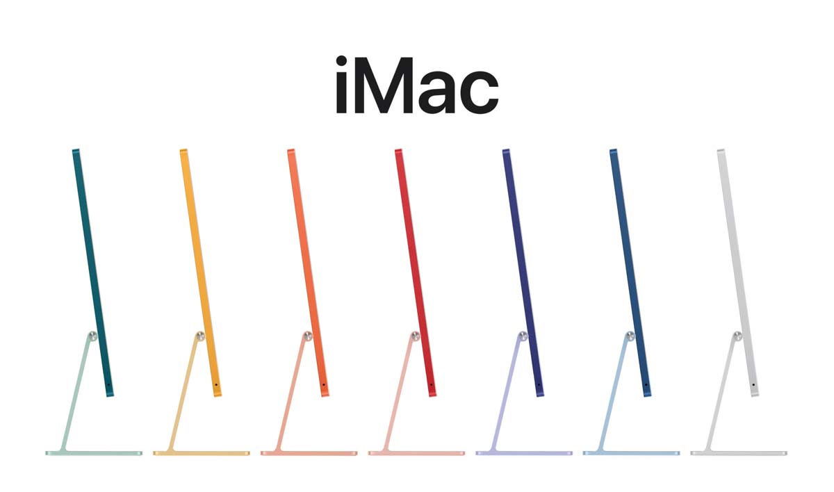
We knew the new Macs would be using Apples new M1 chip – much to the disappointment of poor old Intel – and we knew that it would have a nice big screen, and as thin a form factor as the M1 System on a Chip (SoC) would allow. And the iMac is as thin as I would think it would be – as the M1 is the same one used in the Macbook Pro, and Air released earlier in the year. The same M1 chip that now graces the brand new 2021 iPad Pro that was announced along with the new iMac.
However, Apple breaks its own long-running design axioms, and I’m not sure I like it.
I would almost go as far as to say the iMac is ugly.
Now before you start saying that it is what’s inside that counts, and the outside doesn’t matter. And while, I do agree with that – and will be getting to the somewhat disappointing internals in a bit – I feel that car companies and computer companies, along with Playstation and Xbox, know that if you’re spending a big chunk of change on a product, you’re likely to want it to be aesthetically pleasing, and not just functional.
But for me the design is just, well… wrong.
The Problem with the 2021 M1 iMac Design
As I previously mentioned, the iMac breaks long-standing Apple design trends, and axioms, and below I will discuss each of them. Most of them might seem silly, but this is decades of design language that ceases to be on a flagship product.
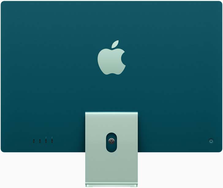
The iMac is designed to be seen from the back
In the Apple spring event, Colleen Novielli of Mac Product Marketing introduce the iMac saying “in many places, the back of iMac is the first thing you see” – and to me that says shops or retail environments, and possibly design studios where you will have desks back to back, but I will be looking at the front. All the time.
The White Bezel
Maybe it doesn’t seem like much, but with 5 colour options, you’d think they could throw in a different bezel colour option too. I get they want them to look “light and optimistic” but that just isn’t me 😅. The last iMac (and current intel iMacs) is a thing of beauty. The dark glass and bezels make it look like the entire front is a screen when it’s off, with only a small “chin” below. And then it’s on, the dark colour doesn’t distract from the screens content.

There is a reason that most TVs for example have black bezels now.
Only a few years ago, you could buy iPads with black or white bezels, and don’t forget that the same was true for iPhones. It is only the recent transition to the hon-button-less X,XS, XR, 11, and 12 iPhones that transitioned away from white bezel options, to black only. To my eye, it is more attractive having the screen appear to take up the whole front of the phone. I assume I am not the only one, as it has become pretty much the industry standard.
The iPad Pro dropped the white options too, with the front appearing like one piece of glass when it is off, and the small, distraction-less black bezels around the edge when on.
Of course, you can still get white bezels, by only really shown on the Apple website on the entry-level iPad mini, and 8th Gen iPad. With both the new iPad Air, and iPad Pro models sporting the black bezels.
Not just that, but when Apple introduced the $5000 Pro Display XDR, it went with… can you guess? Black bezels.
So, what does this mean? Well, in Apple’s design language, white bezels are basic, and black bezels are premium or Pro.
iMac returns to its entry-level origins
When the first iMac came out, it was squarely targeting the light-user or non-pro. Well, you could be a pro, but less intensive tasks like writing and browsing. If you were into video editing or music production you would be going for the PowerMac G3, G4, G5 etc. And that is exactly what I was doing at the time.
The G5 was the last desktop forma factor Mac I owned, and that’s when I transitioned to the iMac. The incision of a pretty good screen, and the boost in general performance the iMac was given at the time, made it a very attractive offer.
So much so, that a few years ago, Apple offered the iMac Pro. And though they recently discontinued it, it showed that more and more power users opted for the all-in-one Mac. Myself included.
But the new iMac looks like they are definitely targeting the original iMac audience more. You can run a till system on it, you can browse on it. And though it is very capable with the M1 chip, it still looks like it is aimed at casual users. Like the original iMac. And, it’s only available in one screen size.
There were plenty of rumours before the announcement, that the new iMac screen would be even bigger than the 27″ Intel iMac, but that proved to be wrong. With only a 24″ version announced.
Does that leave room for the iMac Pro, iMac Pro Max, or even the iMac Air in the future? Or am I just a fool that is hoping for something that will never come?
There is no Apple logo on the front
ok, this is probably the most ridiculous of my gripes about the new iMac, but I can’t shake it. I am writing this on a MacBook Pro, and in case I ever forget that there is a handy badge right at the bottom of the screen that proudly says ” MacBook Pro. Across from me is an old iMac that is gathering dust, under that big screen is a beautiful Apple logo. Every iMac to date has had the Apple logo on the front, and most had it on the back too. But now, it is missing from the front entirely.
The Apple logo is iconic. It has graced every product they have created for years. The rainbow Apple icon of my original Performa, to the first iMac, and iPod.
But ok, the iPhone, iPad, and MacBook don’t have the apple logo on the front/side you look at while using. But the iMac always has. Ok, the first iMac just said iMac, but still. The new M1 iMac has NOTHING. It looks like it’s ready for a cheap television movie that has an iMac on screen, but doesn’t have the right to use it, so has to cover the Apple logo so you can’t tell what it is.
Every bit of marketing on the previous iMac showed the front, and so far all the shots I’ve seen of this iMac show the back. This is back for everyone else to see, not the user.
I get optimistic, and light. I get minimalism. But this is so minimal it almost looks unfinished. And why do I need 5 colour options instead of two – black and white bezel options?
The Conclusions… I guess
I’m secretly hoping that they will announce a replacement for the 27″ intel iMac very soon, and it could possibly be the Pro version to this one. Bigger screen, blacker bezel, black back. But maybe I’m dreaming. So, what do I do now? Wait? Or opt for a Mac Mini to tide me over?
If I tweaked the 2021 24″ M1 iMac…
This isn’t my DREAM, but a small tweak. For the dream iMac, I’d have to break out the 3D and I just don’t have that kind of time at the moment. Soon, maybe. But for now, this is what I’d quickly change to make it more inclined with what I’d have hoped. Hate it more or less? Let me know what you’d change in the comments below.

Now Apple had their latest event, in that they launched new Macbooks pro with the M1 Pro And M1 Max. Really the MacBooks are highly capable. I love the design and the replacements. This time Apple has done a good job.
What do you think about the new Macbooks?
Yeah, I really like them. I was sad to see MagSafe removed all those years ago, as I thought it was such a clever idea. I don’t make a habit of tripping over my charging cable, but there have been about 2 incidents in the last year that I wished I had MagSafe. If only to protect the thunderbolt/USB-c ports from damage. The SD card reader is nice, but not a necessity for me, and the same with the HDMI port. But I am one of the small percentage that will miss the touch bar even though I only used it occasionally.